.png?width=200&height=89&name=CC%20%20fiserv.%20(3).png)
Step-by-Step:
Step 1: Open the page in Elementor:
From the WordPress dashboard, click Pages, then All Pages. Hover over the page you want to edit and click Edit with Elementor. If you are viewing the live page while logged in, you can also click the Edit with Elementor button in the top admin toolbar.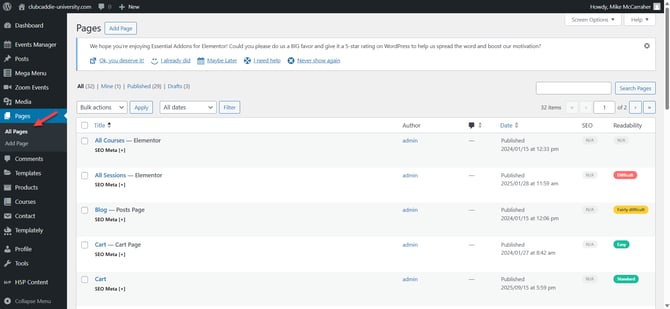
Step 2: Add a new section for your CTA button:
In the Elementor editor, scroll to the area where you want your new call-to-action button. Click the + icon where it says Drag widget here and choose a one-column layout (or another layout if you plan to add more elements beside the button).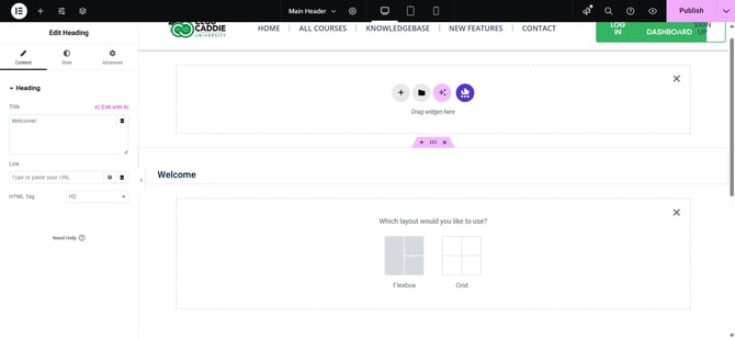
Step 3: Add the Button widget:
In the left Elementor panel, type button into the search bar. Find the Button widget, then drag and drop it into the section or column you just created. The button will appear on the page and its settings will show in the left panel.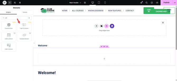
Step 4: Configure basic button content:
With the Button widget selected and the Content tab open, type your call-to-action text into the Text field (for example, “Book Now” or “Get a Quote”). In the Link field, paste your target URL or anchor link (such as /book-now or #contact). Use the Size dropdown (Small, Medium, Large, XL) and Alignment options to adjust the overall size and position. Optionally, add an Icon (such as an arrow) before or after the text for extra emphasis.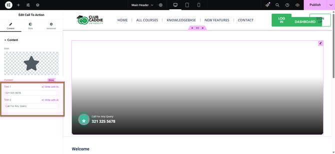
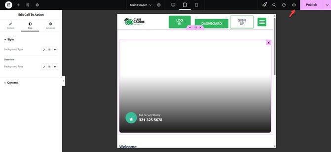
Step 5: Style the button appearance:
Click the Style tab. Under Background Type, choose a Solid color, Gradient, or Image background for the button. Adjust Text Color and Background Color so the button stands out clearly. Use Typography to choose a font, increase font size, and make the label bold and readable. Add a Box Shadow for depth and adjust Border Radius if you want rounded or pill-shaped corners.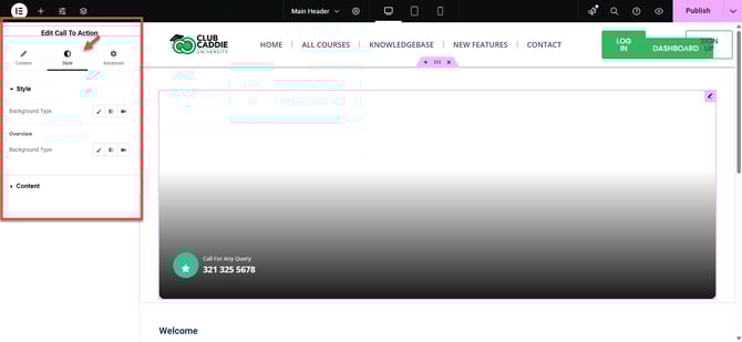
Step 6: Add hover effects to draw attention:
Still in the Style tab, go to the Hover section. Set Hover Background Color and Hover Text Color to give visual feedback when users hover over the button. Choose a subtle Hover Animation (such as Grow or Shrink) to make the CTA feel more interactive without being distracting.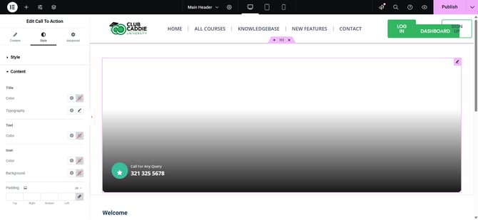
Step 7: Make the button responsive for mobile and tablet:
At the top of the Elementor panel, click the Responsive Mode icon. Switch between Desktop, Tablet, and Mobile views. In each view, adjust button Size, Alignment, and Padding under the Content, Style, or Advanced tabs so the button is easy to tap and looks balanced on smaller screens.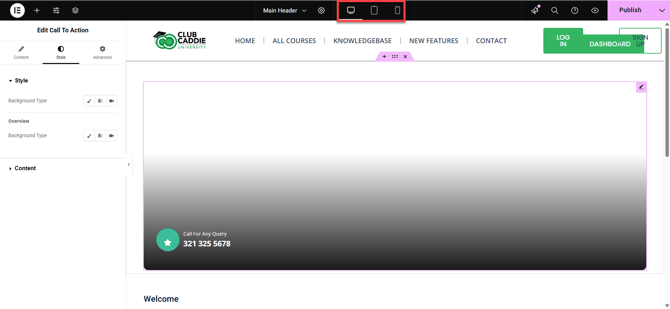
Step 8: Preview, test, and save:
Click the eye (Preview Changes) icon to open a preview of the page. Test the button by clicking it to verify the link works and the hover effects look correct. When you are satisfied, return to Elementor and click the green Update button in the bottom-left corner to publish your new call-to-action button.