.png?width=200&height=89&name=CC%20%20fiserv.%20(3).png)
Step-by-Step:
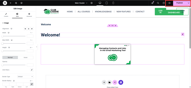
Step 1: Select the image widget to style:
In the Elementor editor, scroll to the image you want to adjust and click on it. The left sidebar will show the Image widget settings.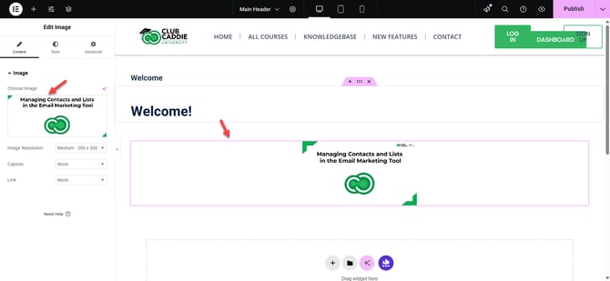
Step 2: Set image size and alignment:
In the Content tab, use the Image Size dropdown to choose a preset size such as Medium, Large, or Full, or select Custom to enter an exact width and height in pixels. Use the Alignment options (Left, Center, or Right) to position the image within its column.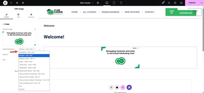
Step 3: Add borders and rounded corners:
Click the Style tab in the left panel, then look for the Border section. Choose a border type (such as Solid, Dotted, or Dashed), set the border width, and pick a border color. Use the Border Radius field (for example, 10px) to round the image corners for a softer look.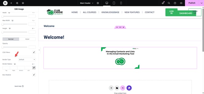
Step 4: Apply a box shadow:
In the Style tab, locate the Box Shadow controls. Turn them on and adjust the color, blur, spread, and position to add a subtle drop shadow that gives the image more depth on the page.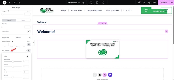
Step 5: Configure hover effects (optional):
Still in the Style tab, switch to the Hover state (often labeled Hover or under Style > Hover). Choose a Hover Animation such as Grow, Shrink, or Fade, and adjust Opacity or CSS Filters (like brightness or blur) to create a simple interactive effect when visitors move their mouse over the image.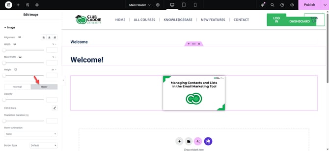
Step 6: Enter responsive mode:
At the bottom left of the Elementor panel, click the Responsive Mode icon (screen and phone icon). Select Desktop, Tablet, or Mobile to preview how the image looks on each device type.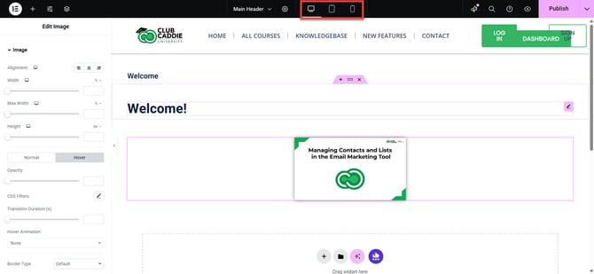
Step 7: Adjust visibility and spacing on devices:
While in each device view, use the Style tab to tweak image size if needed. Then go to the Advanced tab. Under Responsive, choose whether to hide the image on specific devices (for example, hide on mobile if it is not needed). Under Margin and Padding, adjust spacing around the image so it does not appear cramped or too far from other content.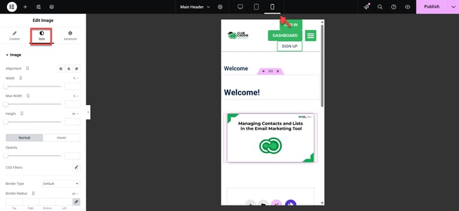
Step 8: Save and preview across devices:
When you are satisfied with the styling and responsive settings, click the green Update button at the bottom left to save your changes. Click the eye (Preview) icon, then switch between Desktop, Tablet, and Mobile views in the preview to confirm the image looks good and functions correctly on all devices.