.png?width=200&height=89&name=CC%20%20fiserv.%20(3).png)
Step-by-Step:
Step 1: Select the text block to style:
In the Elementor editor, click on the text block (Text Editor widget) you want to style. The widget’s settings will appear in the left panel.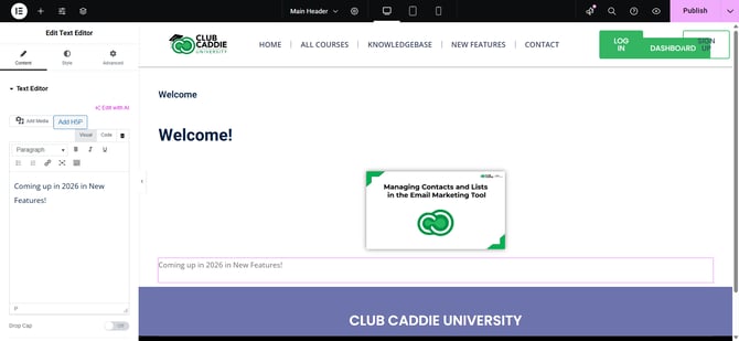
Step 2: Open the Style tab:
In the left panel, click the Style tab to access visual styling options for the selected text.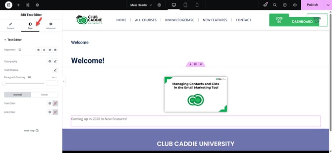
Step 3: Change text color:
Under the Style tab, look for the Text Color option and click the color box. Choose a color from the palette or enter a hex/RGB code (for example, #003366) to set the text color.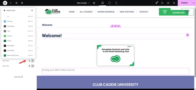
Step 4: Adjust typography settings:
Under Typography, click the pencil icon to open full font controls. Choose a Font Family (such as Roboto or Open Sans), set the Size (in PX, EM, or REM), adjust Weight (how bold the text is), use Transform (uppercase, capitalize, lowercase), and fine-tune Line Height (space between lines) and Letter Spacing (space between letters).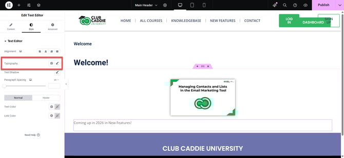
Step 5: Enter responsive mode:
At the top of the Elementor panel, click the Responsive icon (screen/phone icon). Choose Desktop, Tablet, or Mobile to switch the preview and settings for each device type.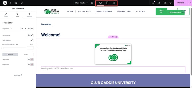
Step 6: Set device-specific font size and spacing:
With a device selected (Desktop, Tablet, or Mobile), go to Style > Typography. Use the small device icons next to fields like Size and Line Height to set different values for each device so your text is easy to read on all screens.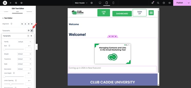
Step 7: Save and preview on all devices:
When you are satisfied with the styling, click the green Update button at the bottom left to save your changes. Use the eye (Preview) icon, then switch between Desktop, Tablet, and Mobile views in the preview to confirm the text looks correct on every device.